
The Seasons, Colour and The Queen
Angela Kelly, joined the Royal Household in 1994, as one of Her Majesty’s Dressers. Her official title is Personal Assistant, Adviser and Curator to Her Majesty The Queen (Jewellery, Insignias and Wardrobe). She led the team who together created the Queens Diamond Jubilee Wardrobe (celebrating 60 years on the Throne) in 2012.
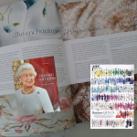
Vogue covered all the appearances of the Queen during the Jubilee year. They created an infographic based around the colours and pattern choices for clothes, that the Queen made during the year. It’s a fascinating glimpse into the variety of colour and colour palettes, that the Queen chooses.
As Angela Kelly writes in her book “Dressing the Queen”, colour is one of the key considerations when choosing a fabric for a new garment. Of course, it needs to suit Her Majesty, but it also needs to suit the occasion. While vibrant colours will help the Queen stand out in a crowd during the daytime, they may be less suitable for evening events when artificial lighting or even candlelight may be used. This can have a major impact on the appearance not only of the colour but also can impact the texture of the fabric too.
As Kelly writes, the Queen is aware of the symbolic association of colours and their association with different emotions – so colour may be chosen specifically to convey a message such as happiness, condolence or respect.
While the fashion world generally work to two major collections in a year (SS/AW), for Her Majesty, all the seasons are equally important.
In the chapter, “The Enchantment of the Seasons”, Angela Kelly explores how this affects not only the choice of colour for clothes, but also the fabrics, concentrating on the seasons of the UK climate.
In spring, bright flowers emerge as the land warms after winter, and bright yellow daffodils, bluebells and mauve and purple crocuses appear. This inspires Kelly “to introduce delicate paler colours into the Queens wardrobe and silk dresses with spring flower motifs”.
Summer floral patterns work well with both vibrant colours and pastel shades. Kelly will often use “a luxurious silk lining in a bright colour to add contrast and highlight the cool” nature of the summer palette.
Her Majesty’s outfits take inspiration for the autumn season, taking shades from the autumnal colour analysis fan and may favour russet red, bronze and copper, blue-black plum and dark green.
In the alst season of the year, winter, the colour palette changes once again to include “antique gold, royal blue, deep purple and rich claret”.
In the year of the 60th Diamond Jubilee the Queen also opened the London Olympics (2012). The team needed to find a solid colour which would stand out against the sea of spectators, but one which was not associated with any competing country. The colour choice for this outfit was a pale peach. When you look back at the pictures this colour certainly succeeded.
It would be lovely to see which colours the Queen has been wearing during the Platinum Jubilee year and whether there has been a change in percentage terms, since the Vogue infographic in 2012. I can’t believe that there isn’t a link with the high percentage of blue that the Queen wears most often (29%), and the association of blue being the colour of communication.
Alas, as the Queen has been attending fewer official engagements in the last few months, should Vogue track the wardrobe choices for the Platinum Jubilee, we may never really know the true colour choices made in this Jubilee year.
I wish Her Majesty a Very Happy Jubilee and many more years of colourful dressing.
Original article by Helen Kendall-Tobias MACC June 2022
Training with Imagination
Reference: Dressing the Queen – The Jubilee Wardrobe, by Angela Kelly
If you’d like to find out more about colour and the seasons you might find our Seasonal Colour Analysis 101 article of interest. If you would like to train in Colour Analysis – there is more about our Diploma Course here.